
Timeline: 5 Months (Ongoing)
Role: Design System Architect
Documentation Stack: Figma, ZeroHeight, Jira
The Challenge: Scaling SEL with Product Integrity
Character Strong provides vital behavioral and emotional development tools for school districts. However, five months ago, the platform faced a significant hurdle: Interface Entropy. Without a unified system, the speed of development was hampered by custom CSS overrides, and the "Cognitive Load" for educators was increasing due to inconsistent data patterns. I was tasked with building a "Single Source of Truth" from the ground up.
Phase 1: The Diagnostic (Month 1)
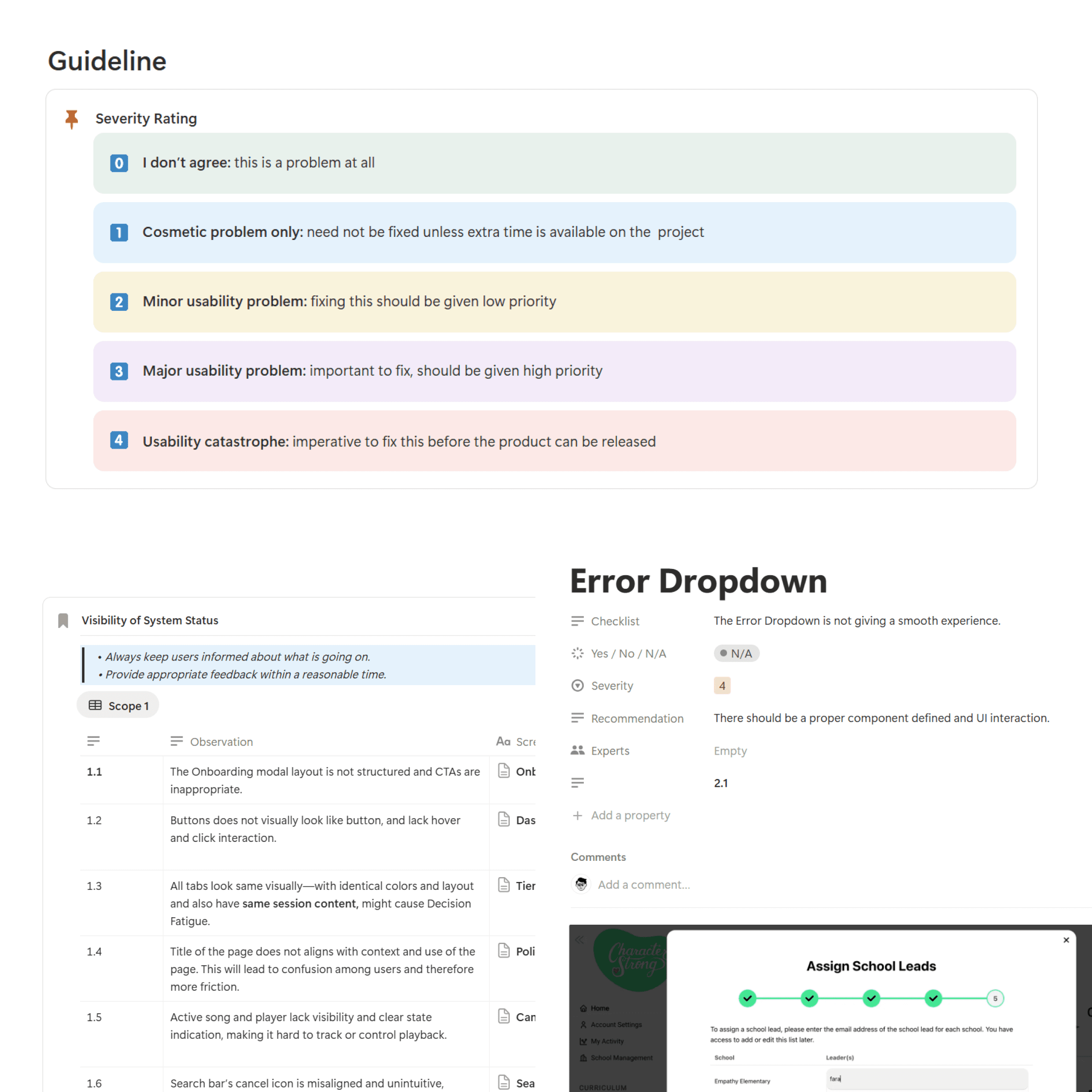
Objective: Identify systemic friction before pushing pixels.
The UX Audit: Conducted a deep-dive heuristic evaluation of the legacy dashboard. I mapped 40+ screens to identify patterns of failure, specifically in "Status Visibility" and "Data Interpretation."
The Rainbow Problem: Discovered that the erratic use of color in behavioral charts was causing "Decision Paralysis."
Stakeholder Alignment: Collaborated with the Design Director and CS team to define the "North Star" for the system: Clarity over Decoration.
Phase 2: The Core Architecture (Month 2)
Objective: Establish the mathematical and logical foundations.
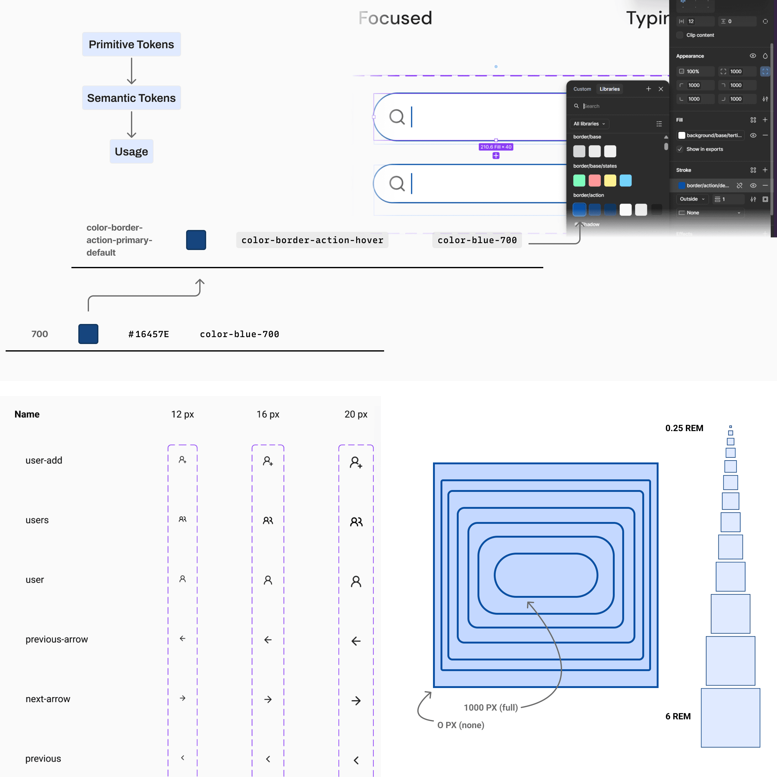
Tokenized Variables: Engineered a Two-Tier Token System (Primitive > Semantic). This allowed us to define a global "Source of Truth" while giving us the flexibility to swap "Status" themes across the entire platform in minutes.
Fluid Spatial Logic: Established an 8pt Grid using a REM-based system (1rem = 16px). This ensured that high-density administrative dashboards maintained a consistent vertical rhythm and accessibility across different devices.
Chromatic Normalization: Refactored the data-viz language into a Monochromatic Sequential Scale, ensuring behavioral tiers are distinguished by value and saturation rather than distracting hues.
Phase 3: Atomic Maturity (Months 3–4)
Objective: Build the building blocks for complex workflows.
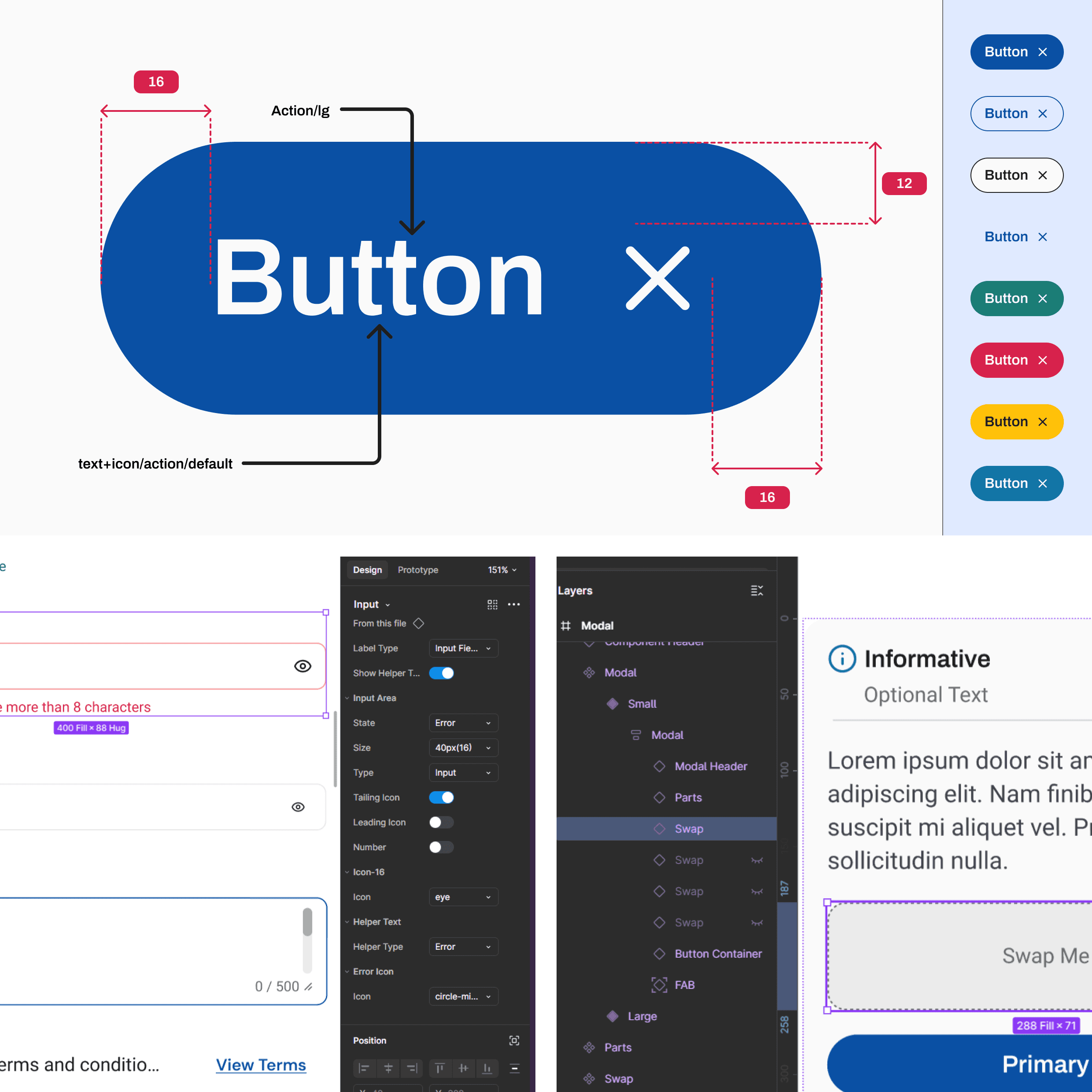
Atomic Construction: Built out the core atoms—Buttons, Inputs, Status Badges, and Tooltips—using strict Boundary Logic (min/max widths and character limits) to prevent layout breakage with real-world data.
The Molecular Leap: Progressed into basic molecules, including a highly complex Date Picker module and Feedback Toasts, ensuring every state (Default, Hover, Focus, Loading, Error) was accounted for.
Technical Reconciliation: Negotiated a critical "Icon Constraint." While the team preferred line-based assets over vectors, I developed a specific CSS implementation spec to ensure stroke weights and colors remained consistent during component state changes.
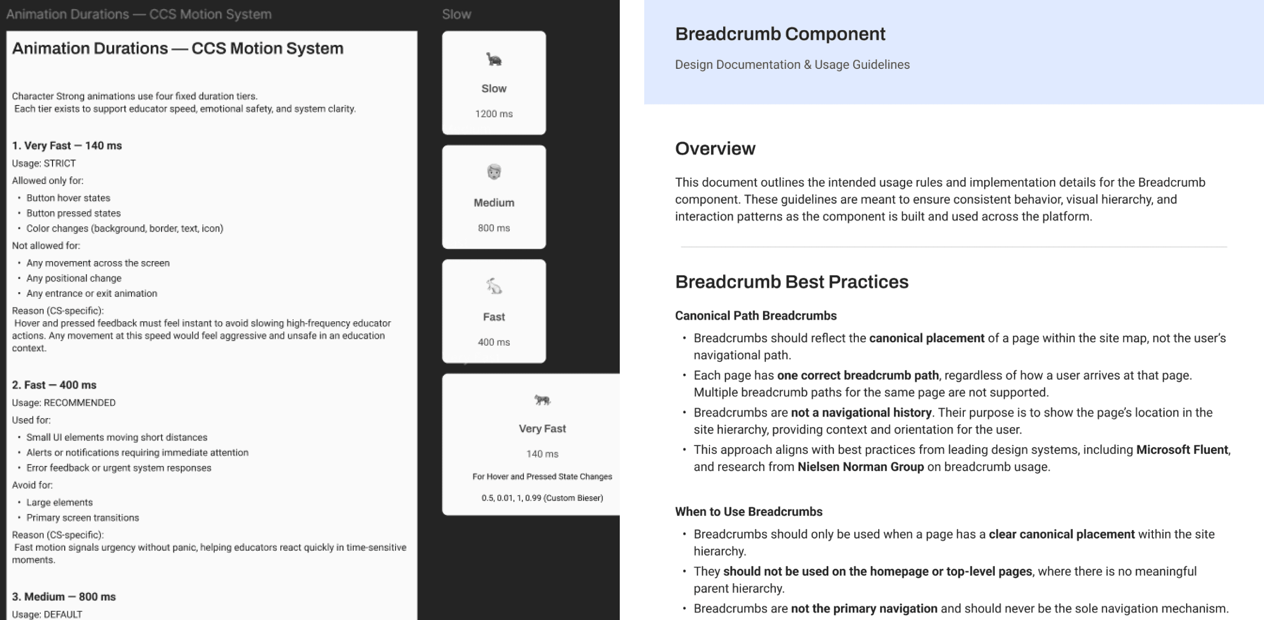
Phase 4: The Documentation Hub (Month 5 – Present)
Objective: Centralize the system for cross-functional adoption.
ZeroHeight Integration: I am currently migrating all system logic to ZeroHeight. This isn't just a component gallery; it’s a "System Playbook" that includes:
Usage Guidelines: Clear rules on when to use specific atoms (e.g., Toast vs. Alert).
Developer Specs: Live code snippets and token mapping to reduce "Handover Friction."
Design Rationale: Documenting the why behind our spacing and color choices to ensure the system’s integrity remains intact as the team grows.
Current Progress & Impact
While the project is ongoing, the Phase 1: Foundation is already paying dividends:
Reduced Design Debt: By starting with a UX Audit, we are building solutions for actual friction points, not just aesthetic ones.
Engineering Velocity: The semantic token system has already streamlined the handoff process for our current "Atoms."
Predictable UX: The transition to a monochromatic data scale has paved the way for more intuitive behavioral reporting as we move into "Organism" level designs.