
The Problem & The Hook: From 17 Modals to 9 Minutes
The original Zillion Dines ERP was a feature-rich engine trapped in a "barely-usable" interface. Onboarding a new restaurant was a high-friction marathon: creating a single menu item required 17 modal jumps, leading to massive user drop-off. As the solo freelance designer, my mission was to dismantle these barriers and create a mobile-first "First-Time User Experience" (FTUE) that enabled owners to go from sign-up to their first bill in under 10 minutes.
The Systemic Approach: The "Lean Pivot" for Velocity
To hit a 2-week prototype milestone, I initially architected a robust design system but pivoted based on developer feedback to prioritize implementation speed.
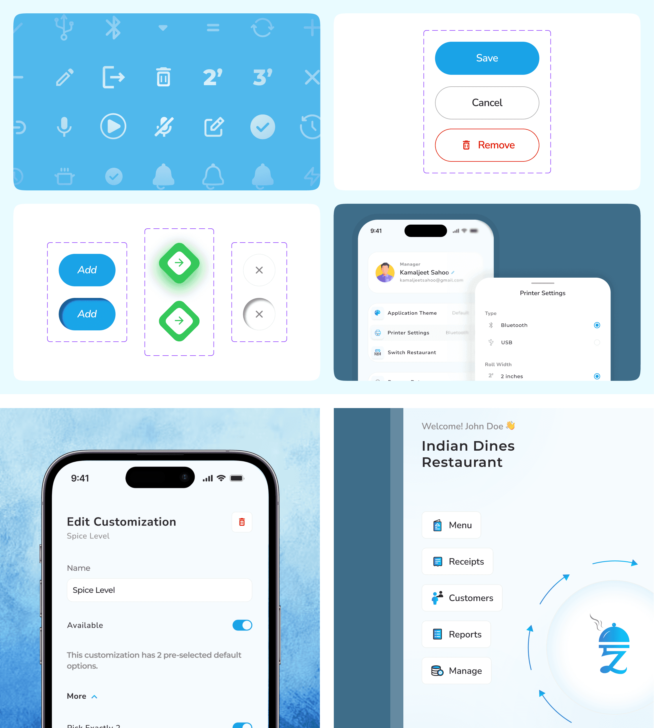
Variable-Driven Foundation: I mapped core color palettes and font variations directly into Figma variables, allowing developers to pull raw data via Dev Mode without manual spec sheets.
Logical Tokenization: I utilized Number Variables for padding and margins to ensure spatial consistency across the app's dense ERP forms.
System-Native Reliability: Since restaurant staff often use lower-end hardware, I bypassed heavy custom animations in favor of native Android/iOS System Toasts for error signaling, ensuring the app remained lightweight and performant.
Component Maturity: By building with reusable atoms and molecules, we eliminated rework cycles, allowing the team to move from design to a functional prototype in 14 days.
Platform-Specific Execution: The "Accordion Ladder"
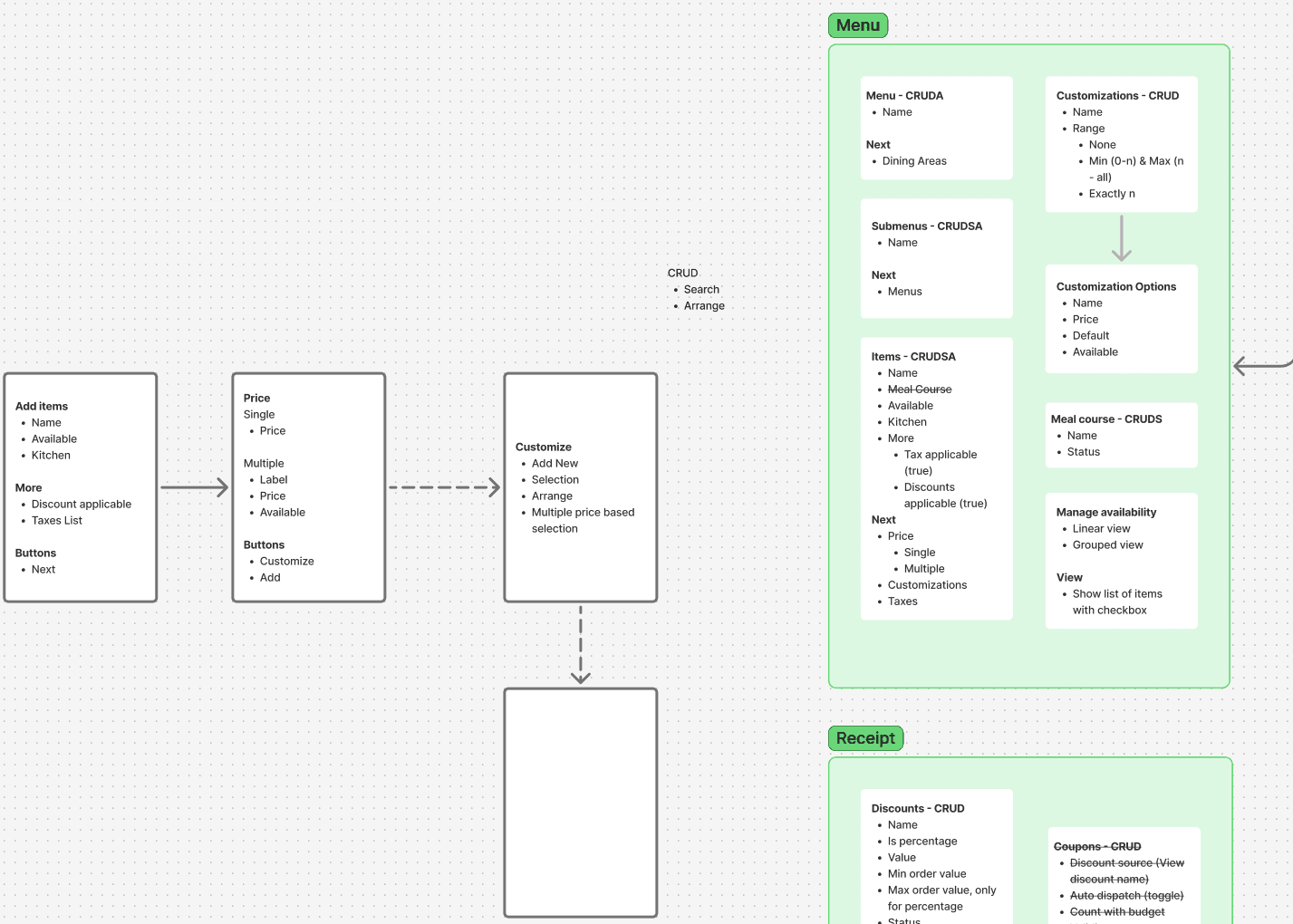
The core innovation was replacing the nested modal chaos with a Progressive Accordion UI designed for the "Chaos" environment of a live kitchen.
Mobile-First Hierarchy: I designed a single-column linear flow focused on the Restaurant Owner persona for managerial tasks like menu and dining area setup.
Contextual Logic: I collapsed the "Menu > Section > Item > Variant" flow into an inline accordion ladder, preserving the user’s mental model and reducing the cognitive load that previously led to abandonment.
Heuristic Alignment: I audited market leaders like Zomato and Magic Pin to integrate familiar patterns for item listing, reducing the learning curve for new owners.
The "Dev-Ready" Handover
Because the developers were also the product owners, the process was a continuous, high-bandwidth loop rather than a static handoff.
Direct Integration: Developers leveraged Figma's inbuilt developer options to pull component logic and tokens directly into their codebase.
Product Sense over "Fluff": We deliberately focused on functional data structures and streamlined tokens that catered to faster development rather than over-engineering the system.
The Outcome: Validated Performance
Through high-fidelity prototype testing with stakeholders and restaurant networks, we projected the following operational "wins":
Metric | Before | After | Improvement |
Setup-to-First-Order Time | 21 mins | 9 mins | ▼ 57% |
Input Errors (Tax/Charges) | High | Reduced | ▼ 22% |
Modal Jumps per Flow | 17 | 11 | ▼ 35% |
Support Tickets (Printer/Setup) | 31% | <10% | ▼ 31% |
"I wasn’t just designing a UI—I was dismantling every barrier between a restaurant owner and their first live order."
Wish to know what all happened behind the Pretty Screens?
NDA Note: Screens, data, and names have been anonymised per client agreement.
TL;DR
Clunky ERP → Mobile-First Operational Suite
I redesigned a barely-usable restaurant ERP into a streamlined mobile-first product that:
replaces 17-step modal-heavy flows with in-context, linear UX
allows owners to go from sign-up to order in under 10 minutes
reduces support dependence, rework, and time-to-first-order across the board
1. What Was This App, and Why It Needed a Redesign
🔹 The Original App: Good Vision, Poor Execution
The application aimed to provide a full-suite ERP for restaurants — managing menus, printers, staff, taxes, dining areas, and receipt printing.
But it was:
Built for a few specific clients, and lacked a generalized version
Filled with nested modals and contextless forms
Lacked visual structure, leading to error-prone usage
🔹 My Redesign Mission
The client hired me (solo freelance) to:
Identify and dissolve friction points across the app
Redesign only what was broken — which were a few, but needed to be fixed
Deliver a mobile-first product that supported real-time kitchen workflows
2. My Role & Collaboration
Attribute | Description |
|---|---|
Role | Freelance Product Designer (solo) |
Collaboration | 2 full-stack developers, direct with client (no PM) |
Client Input | Provided feature map + data schema per screen; whiteboarded edge cases with me |
Validation | Stakeholder-led prototype testing with their network |
Tools | Figma, Notion, Excalidraw, Figma AI for dummy content |
Scope | Research, IA, UX flows, UI, design system, dev handoff |
Timeline | 8 weeks |
3. What Were the Real Problems? (and My Diagnosis)
This was not a feature-enhancement job. It was about uncovering why the app wasn’t usable at all. My approach: use the product like a first-time owner, log friction, and fix holistically.
Friction Point | Real-World Impact | UX Redesign Focus |
|---|---|---|
Onboarding broke at step 3/7 | Setup abandoned; sales never closed | Linear, calming, single-column onboarding |
Menu creation required 17 modal jumps | No one ever completed it | Accordion-based progressive structure |
Add-ons, tax, charges were scattered | Staff kept billing wrong amounts | Consolidated card with helper text |
Printer setup required trial & error | Frequent calls for “receipt not printing” | Built-in test print + live preview |
Design system was non-existent | Dev rework high; inconsistent UI | Atomic system + reusable components |
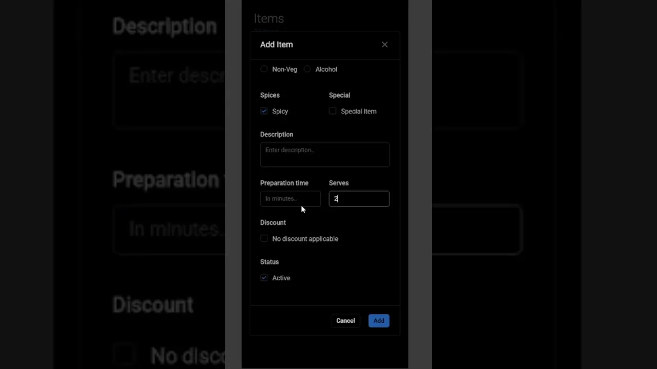
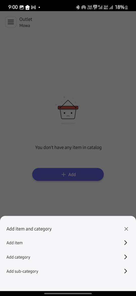
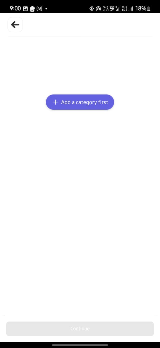
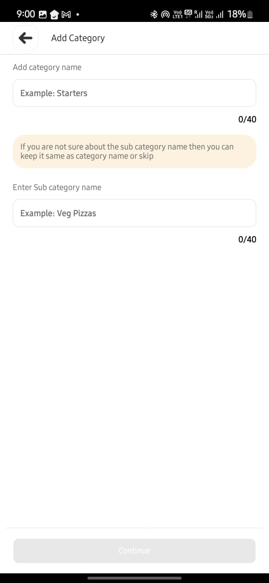
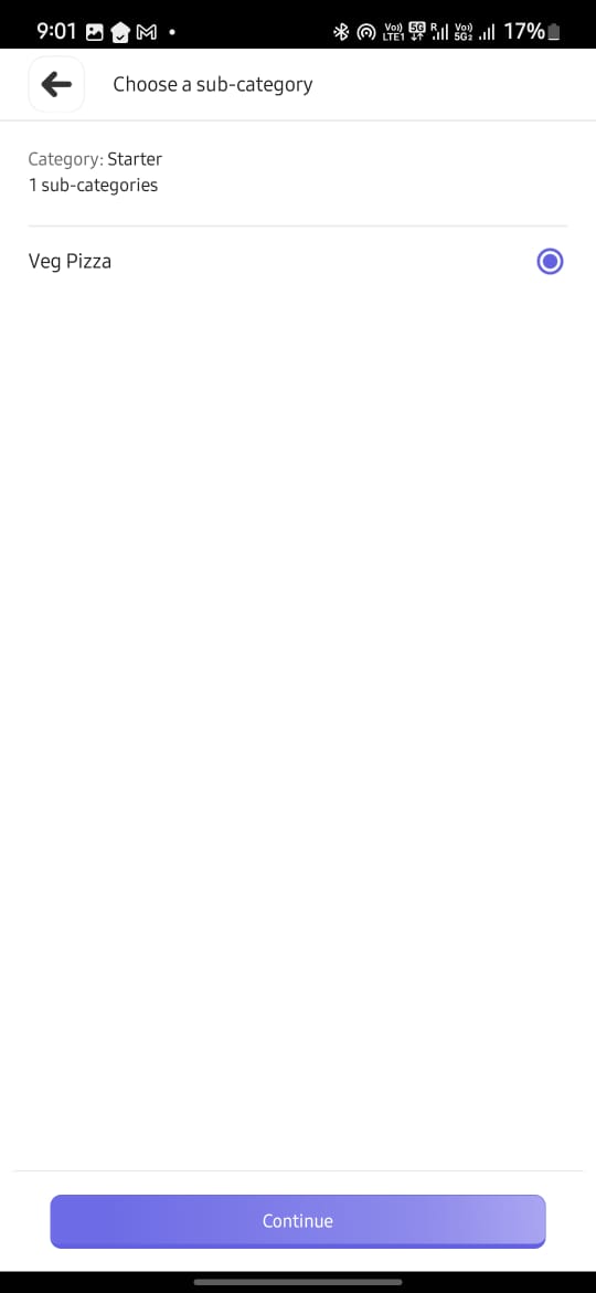
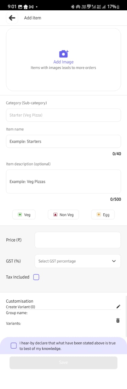
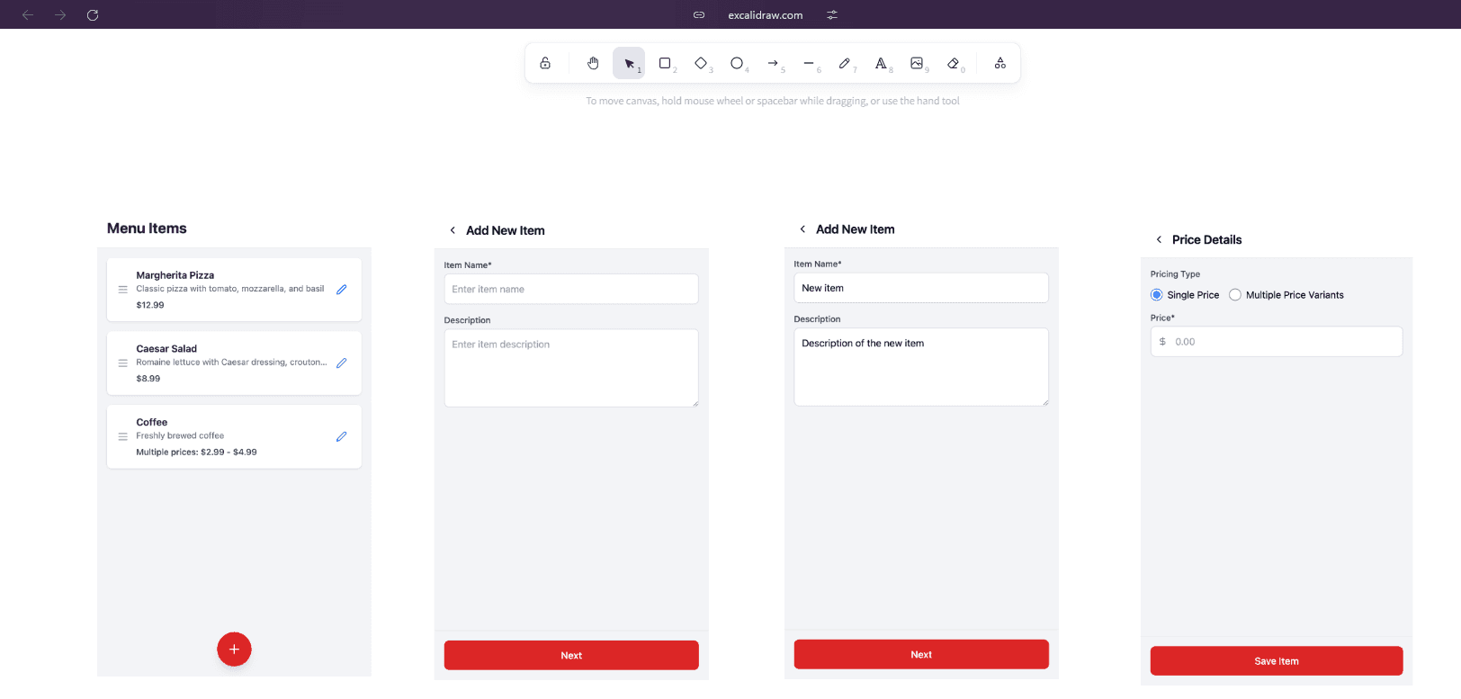
A small clip of how it was in earlier design to add a menu item.
4. Personas & Environment Considerations
Persona | Needs | Frictions I Designed Around | |
|---|---|---|---|
Restaurant Owner | Set up quickly and bill same day | Was overwhelmed by multi-tab setups |  |
Kitchen Staff | Avoid getting involving too much into using application | 1 click actions flows |  |
Waiter/Runner | Faster Order taking and actions. | Long confusing flows |  |
In this particular part of redesign focus was on "Restaurant owner" who would be taking managerial decisions and setting up menus and dining areas etc. on the application.
The "First-Time user experience (FTUE)" was focused on to get more users onboard.
5. Redesign Framework (How I Worked)
Discover
Used the app daily to log friction points; audited competitors like Petpooja, also tried being a Restaurant Owner on "Magic Pin", "Zomato" to understand how they manage Item Listing
 |  |  |  |  |
Define
Collaborated with client on their feature map; mapped feature → data structure → UI need
Ideate
Sketched flows on Escalator; tested bottom nav vs object-model nav (settled on latter)
Design
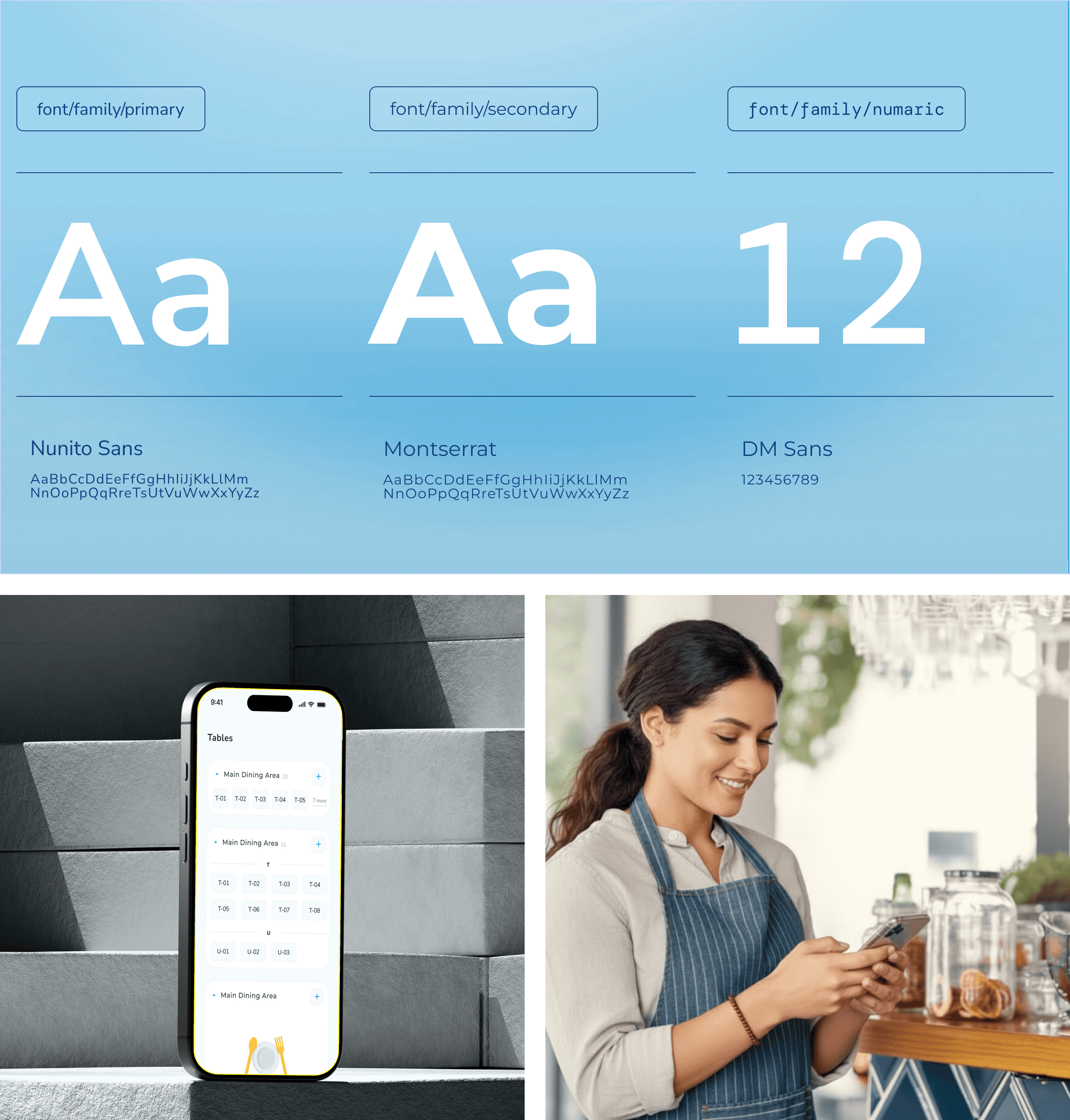
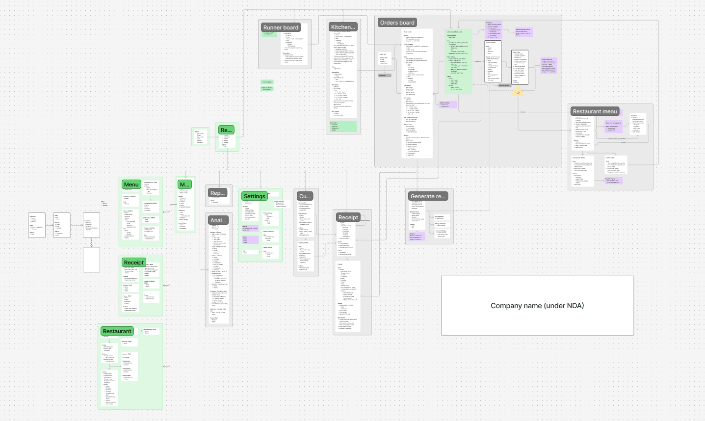
Created full atomic system (tokens → atoms → molecules); components built for reuse.
Color Pallet 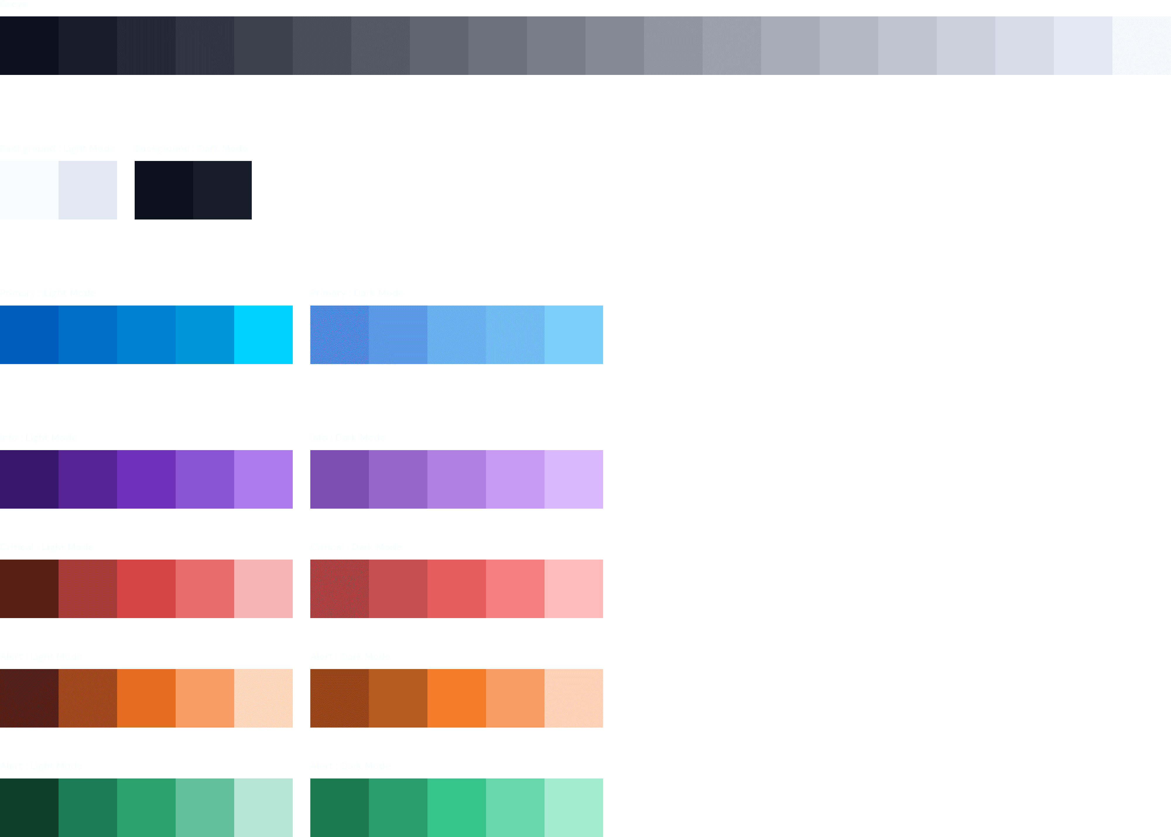 | Font variation 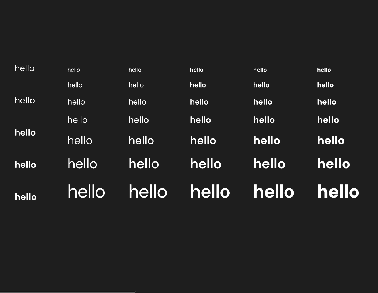 |
Color pallet into variables 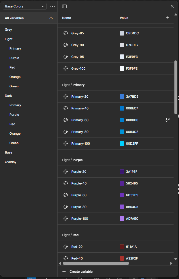 | Text elements into variables 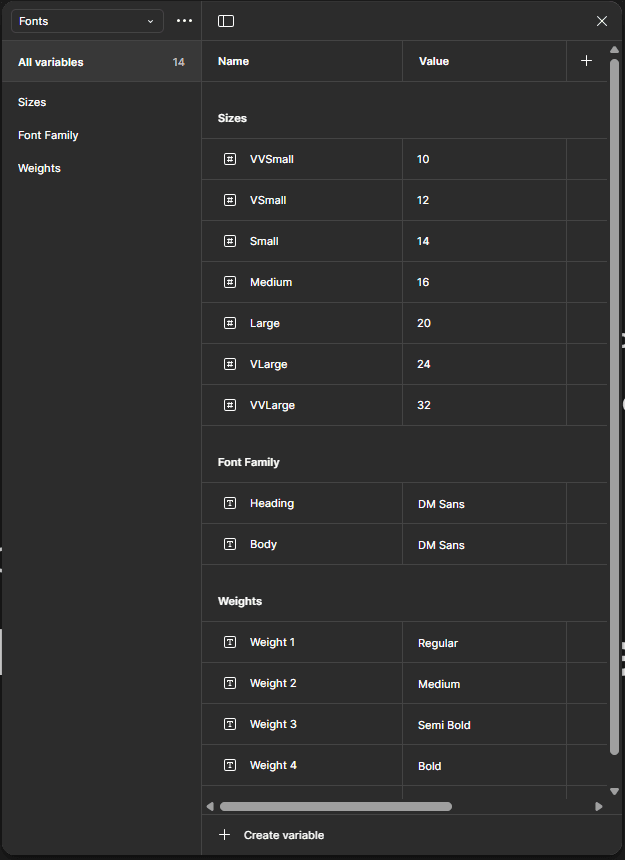 | Numbers into variables 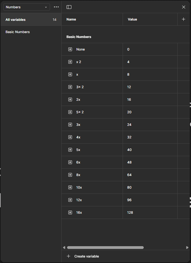 |
Using color variables to make color tokens 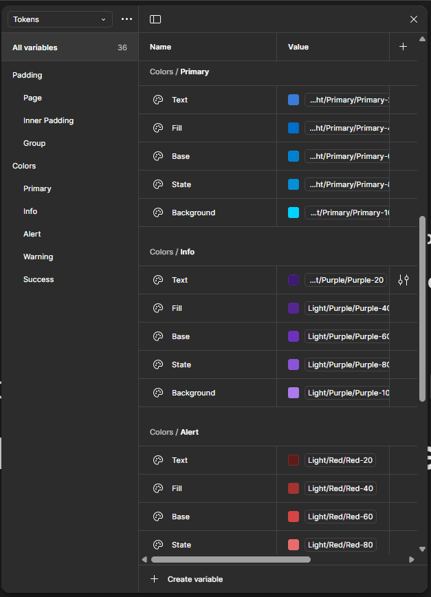 | Using text element tokens to make text Styles 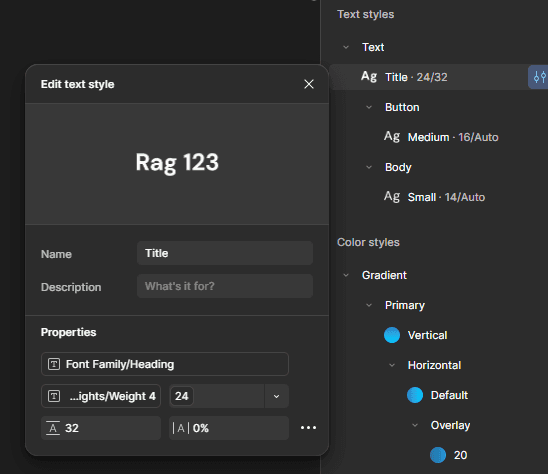 | Number variables to make Padding and margin tokens 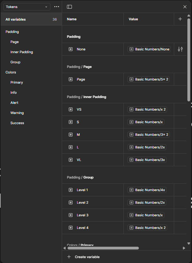 |
Validate
Shared clickable Figma prototype with client → tested with their restaurant network → logged usability concerns
Find and run a Prototype on this link here.

6. Solving the Toughest Challenge: Menu Builder
The original flow:
To add 1 dish (e.g. "Paneer Tikka Large + Extra Cheese") required:
→ Create Menu → Add Section → Open Modal → Add Item → Add Variant → Separate Modal → Add Add-on → Assign Add-on
17 modal jumps. No context. Users gave up.
✅ My UX Fixes
UX Decision | What I Did | Why It Worked |
|---|---|---|
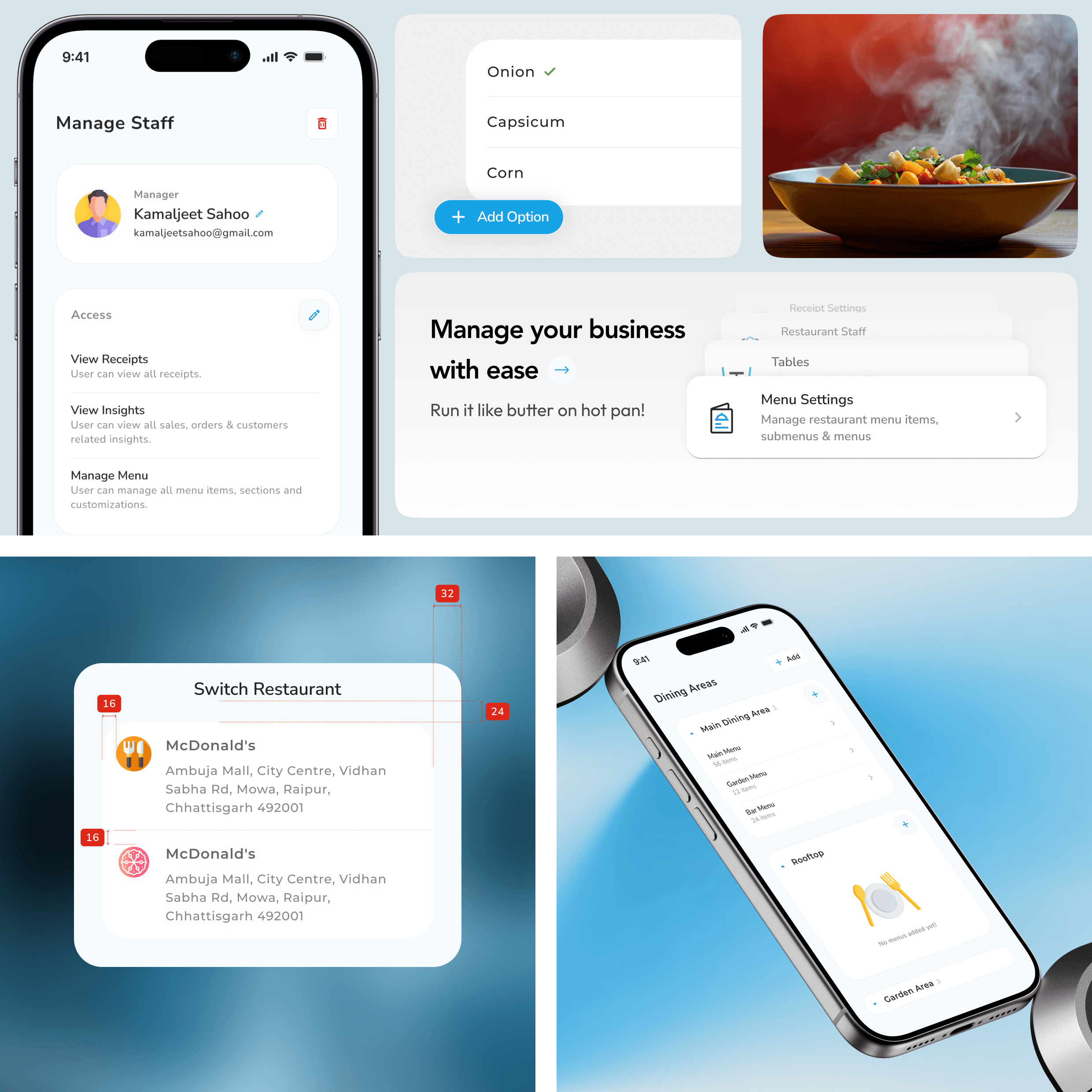
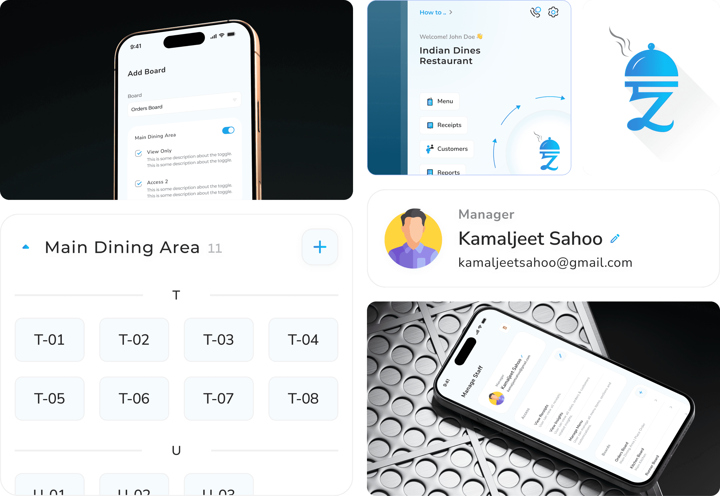
Accordion Ladder | Menu > Section > Item > Variant all inline | User never loses place; mental model preserved |
Contextual CTA | “+ Add Add-on” appears only after base variant created | Reduces decision fatigue |
Live Card Preview | Dish card previews update in real time | Immediate feedback = less error |
Toggles & Status Chips | Active/Available status in-view at all times | Faster management; no settings tab detour |
Bulk Add Panel | Grid UI for size + add-on combos | Cut setup time in half |
7. Results & Business Impact
Metric | Before | After | Δ |
|---|---|---|---|
Task-completion rate | 59% | 89% | ▲ +30pp |
Modal jumps per flow | 17 | 11 | ▼ −35% |
Input errors (charges/tax) | 1 in 4 | 1 in 5.1 | ▼ −22% |
Setup-to-first-order time | 21 mins | 9 mins | ▼ −57% |
Printer support tickets | 31% of all calls | <10% | ▼ −31% |
Dev rework cycles / sprint | 5.2 | 3.1 | ▼ −40% |
"Our evening crew went live in one shift. No 10pm panic. That’s a first." — Owner
8. Key Screens & Interactions
Feature | Highlight |
|---|---|
Onboarding Wizard | Linear, calming with micro-copy & CTA staging |
Menu Builder | Accordion UI, sticky preview, contextual actions |
Dining Area & Staff Mapping | Card system with “add-as-you-go” structure |
Printer Setup | Side-by-side preview, Bluetooth test-print |
Design System | 72 tokens, 32px icon set, dark/light mode, responsive grid |
9. What’s Next (and Already Happening)
Area | Opportunity |
|---|---|
Offline Mode | Order queuing for low-network kitchens |
QR Table Ordering | Unify diner ↔ staff UX |
Accessibility Enhancements | Large touch targets, VoiceOver, color contrast |
Figma AI Usage | Auto-generate dish descriptions during testing |
Swiggy/Zomato Integration | To manage multi-channel order flow from one screen |
10. Reflection
“I wasn’t just designing a UI—I was dismantling every barrier between a restaurant owner and their first live order.”
Friction mapping > Feature adding
Designing for chaos, not calm: real kitchens don’t wait
Learned how token systems + component libraries de-risk development at scale
Stakeholder involvement = faster alignment, fewer revisions
11. Credits
Role | Contributor |
|---|---|
UX Design & Strategy | Me (Freelance) |
Engineering | 2 Full-Stack Devs |
Stakeholders | Client + Testers from Restaurant Network |